![]()
Revision 4 above incorporates the comments we recieved about Revision 2 and 3, chiefly:
- The crossed cannons should remain to honor the early work of the Armory.
- The subdued color brown reflects the serious work the Armory did during its history and reflects the brownstone and brick. It is also more appropriate for a National Park
- We received comments suggesting we remove the flame but the Ordnance Corp flame and Friends flame differ. We maintained the flame to honor the forge and foundry work done here for nearly 200 years.
- It remains a toss up between using the Arsenal Building and maintaining a variation of the original crest. We suggested an arrowhead replace the bomb as a not to the National Park Service.
We are working on a new logo for the Friends and would like comments from our members and other partners. These are concepts only and will change as the design tightens over time.
Please share your thoughts in the comments section below, at this state we are looking for comments like: “I like the Arsenal Building” or “Still prefer the old Ord. Crest” and so forth. Broad brush strokes at this point. You can email us at [email protected]
Concept drawing of the west side of the Arsenal Blg.
![]()
![]() Above pays tribute to the original crest and the east or front of the Arsenal Building. This is disproportional in height and width but just a rough draft concept
Above pays tribute to the original crest and the east or front of the Arsenal Building. This is disproportional in height and width but just a rough draft concept
![]()
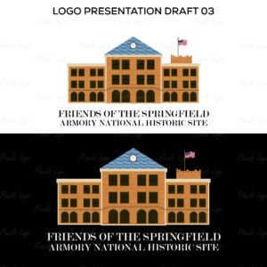
Another use of the main building with color.
![]()
Full tribute to the original Armory crest, still in use on the gates.
I like the use of the building, elegant and classic; people always love to associate with an old building.